The next step in starting your business is printing business cards and other relevant door-opening marketing pieces. In this month’s column, we’ll look at how the choice of logos, colors, card stock, and fonts can make or break your printed materials – and your budget.
LOGO DESIGN: DO’S AND DON’TS:
Keep it clean. Keep in mind that full-color logos are impactful but are more expensive to print. If you are a non-profit, check with your printer to see if one or two colors are less expensive than full color. Remember, you want to keep your money in your organization and not with your printer (I can’t believe I am saying that).
You want your logo to explain who you are and what you do, why you do it, and how you do it. You want to do this ONCE so that when you present it on business cards, “now open signs,” brochures, and menus, your customers will recognize your brand. If you do this correctly, you will make a lasting impression. Think about it, everyone recognizes Pepsi and Nike. Those logos could be updated, but why mess with a good thing?
Be authoritative with your logo, and remember color is key for good design. Most importantly – be memorable. Choose timeless fonts that are easy to read and relevant to your business.
BUSINESS CARD DESIGN: YOUR SECOND BEST IMPRESSION
First impressions are key, and your business card impression should be second.
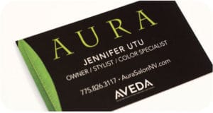
The size of your card, either standard 3.5”x2” or square 2.5”x2.5”, with the option of a Raised/Embossed Logo, are all ways to enhance the look of your cards, and kudos to anyone thinking out of the box.
Choosing the correct card Stock is HUGE.
-
I never recommend a flimsy stock. Go no thinner than an 80# stock or 12pt, and no thicker than a 32pt stock. 32pt is considerably thick and probably overkill unless you like cardboard and are a contractor of some kind.
-
Matte/uncoated stocks are typically used for a blank card back that can easily be written on.
-
Semi-Gloss or UV coated shiny stocks are used mostly for impactful pictures on business cards. But you can also see fingerprints on them (which may be a peeve of yours), so you may consider just Semi-gloss. Both matte and gloss should be a standard small cost to print.
-
Linen, while primarily used in the fields of law or accounting, is still used but not suggested with heavy ink coverage.
-
Soft Touch Lamination: The Cadillac of coatings, is my favorite stock to date. It has the WOW FACTOR and has a soft, velvety touch. This stock is a little more expensive, but I always invest in myself! And remember, it is your SECOND IMPRESSION.
FONTS: THE KISS OF DEATH
You should NEVER use more than four fonts on a card. I typically keep to three at max. If you are using a Helvetica Bold font, consider using a similar Helvetica font for the body of the text as well, maybe in a lighter, or an italic version. In other words, keep it in the family.
NEVER go less than 7pt on your font for addresses or phone numbers. If anything, go larger. There is nothing worse than handing out something that no one can read. The biggest complaint heard is that the text is so small it cannot be read without eyeglasses, ever heard that?
Use the back of your card for something fun, a quote or tagline is good, or you can display a few of the things you specialize in, but no more than three.
Add your website to either side and make it easily legible. Most websites are not case sensitive anymore and there is no need for www.Udontneedthisanymore.com. WWW is outdated and not necessary. An email that is written toniQ@DigiprintCorporation.com is more legible than toniq@digiprintcorporation.com, see it?
All of these tips can be used for anything designed for your business whether it is business cards or a vehicle wrap. You cannot go wrong with these tips.
Keep in mind a good printer will always try to use the most eco-friendly stocks and be FSC certified. For every tree cut down for printing, another is planted. If your printer uses soy-based inks, you can rest assured they too are doing everything in their power to leave a better footprint for your future.
Most imortant tip to take away: Always spell chek!!

NCET is a member-supported nonprofit organization that helps people explore business and technology. (www.NCET.org)
Our very own Toni Quiruz has contributed some good advice to our local community! This article was published on NCET. The original article can be found here.


