
Today, most marketing materials are in a digital format, but so is everything else. People are overloaded with links and web pages – and nobody needs more screen time. That means well-made printed brochures can really help your business stand out!
Whether they’re available at your office, you distribute them at a trade show or conference, or you send them via direct mail, the right brochure can be captivating and memorable, increasing deals, sales, and other important metrics for your business. However, not just any brochure will do.
This begs the question, what do you put on a brochure?
To be impactful, business brochures should contain certain key elements and have a few specific characteristics. As one of the leading custom printing services in Reno and Sparks, NV, we know a thing or two about what to put in a brochure. The components of a great brochure range from a compelling headline to a specific call to action (CTA).
Let’s walk through it!

Table of Content
What to Put On a Business or Marketing Brochure
The Right Brochure Design and Layout
A Specific Call to Action (CTA)
Important contact details
What to Put On a Business or Marketing Brochure
There are lots of different components to consider when designing an effective brochure.
Quality brochures should have…
A Single Purpose
Before you even start thinking about what to put on a business brochure, it’s important to decide why you’re creating it in the first place. This is just as important as putting your company logo on the brochure.
Is it for a specific event, campaign, or new product?
Or is it meant to contain general, evergreen information about your business?
Are you designing it for your next trade show or event?
Whatever the purpose, it should be clear to your target audience right away.
That’s what a brochure should include – a single purpose. This will help your brochure produce the desired result, whether it’s to get more leads or convert your existing leads into sales. Once you have a clear, well-established purpose, designing your sales brochure becomes a lot easier – and fun.
Pro Tip: Keep your brochure’s purpose simple, you have limited space to get your point across. Too many messages can have the opposite effect.
A Compelling Headline
The headline is the first part of your brochure that people will see. It should tell them exactly what they’ll be getting if they pick it up and read it. Make sure your headline is clear and understandable.
Here are a few critical factors you need to keep in mind as you create your own brochure:
- Know your audience. Think about what type of content will resonate with them and craft your headline accordingly.
- Keep it short and to the point. Usually, 8-10 words is the best length for an impactful brochure headline.
- Use clear and attractive words. You can use words like Free, Easy, Quick, and Exclusive. These words can convey what you want to say. But more importantly, they can draw attention immediately.
This will make your brochure headline interesting and intriguing, drawing people in!
For the wording and design part, it’s often better to get help from an experienced copywriter.
Digiprint’s custom brochure printing and designing services offer the complete package under one roof. Our expert designers and copywriters will help you craft the most compelling headlines and make a splash at your next event.
Equally Engaging Brochure Text
Creating engaging content should be next on your list of what to include in a brochure. When writing content, focus on key points and avoid unnecessary details. Provide informative content that addresses your target audience’s needs and interests directly.
Use bullet points to present information in a digestible format. Bullets can make it easier for readers to grasp important facts quickly. Additionally, use headings and subheadings to break up large blocks of text. They should guide your readers through the content and highlight key sections.
Taking these precautions can make your brochure more scannable, allowing readers to find relevant information at a glance. Remember, the goal is to engage your audience effectively and encourage them to take the desired action.
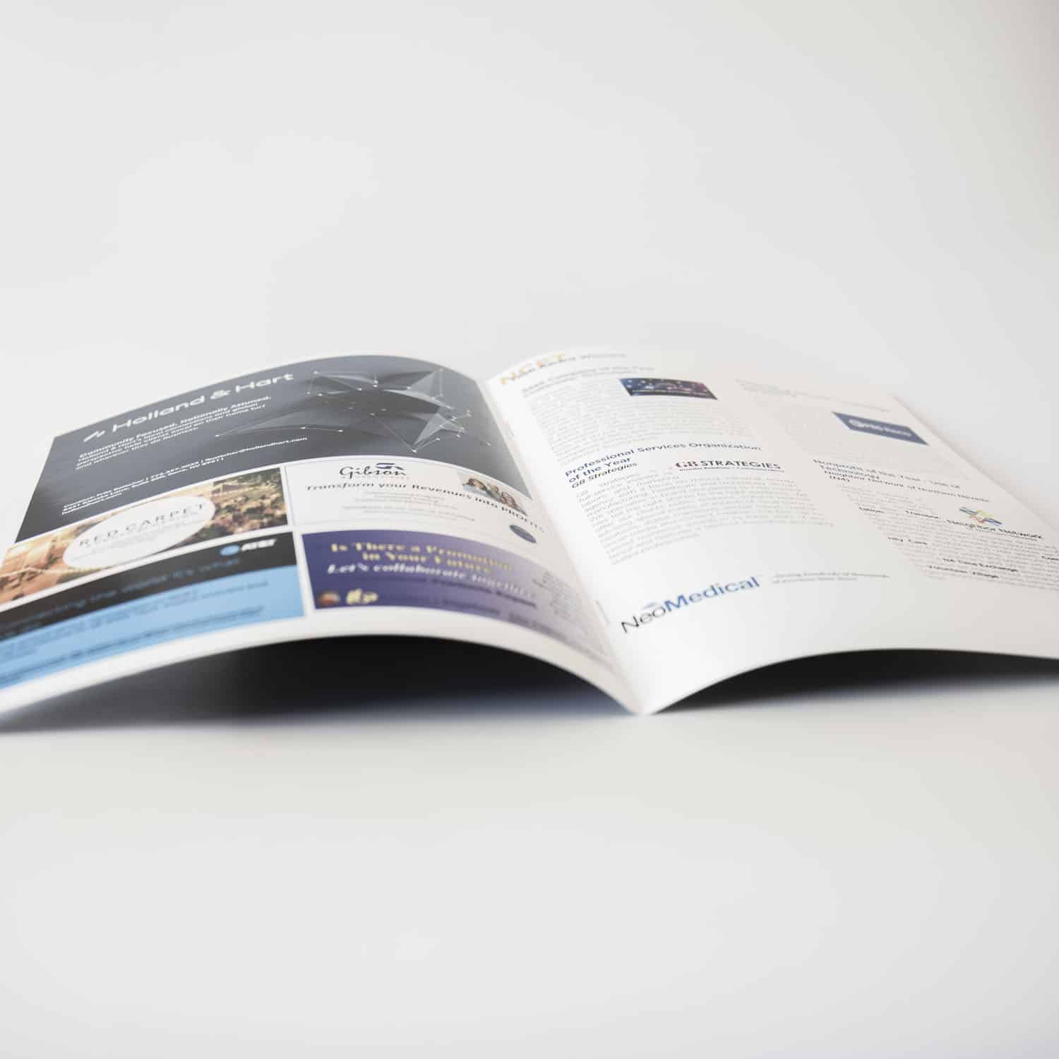
High-Quality Visuals
Visuals tend to be more attention-grabbing than text – but both should function as a unit. Various online data sources support this belief, with people remembering about 20% of what they read and only 10% of what they hear, as opposed to 80% of what they see and do. So, visuals are what you must include in a brochure. That’s just non-negotiable.
Whether it’s images, graphics, or illustrations, choose your visuals carefully. They must help convey your message in a more engaging and memorable way. That’s where high-quality images come in.
High-quality visuals demonstrate professionalism – and work to captivate the audience’s attention from the moment they pick up your brochure. Whether striking photographs, eye-catching graphics, or custom illustrations, be sure each visual element serves a specific purpose and aligns with your overall brand identity and message.
Moreover, ensure that the visuals directly support the content of your brochure and resonate with your target audience. Never use visuals for the sake of it. Keep it relevant, engaging, and professional.
Pro Tip: If you plan to use photos, get high quality ones taken – don’t rely too much on stock photos.
The Right Brochure Design and Layout
Stepping away from what to put on a business brochure, we’re going to shift our focus to how to do it. A well-organized layout guides the readers through the content smoothly and enhances readability and flow. In other words, makes your brochure more desirable.
So, what can you do?
Using grids, columns, and whitespace effectively is necessary for a stellar layout.
Grids
Grids help organize your content. They ensure consistency and alignment across different sections of the brochure. Grids can also help establish a clear hierarchy of information and create visual harmony. This helps your readers navigate the content more easily and makes the brochure look polished and professional.
Columns
Breaking the text into columns allows for better control over the flow of information. It prevents large blocks of text from overwhelming the reader. It also helps you place visual elements like images, graphics, and pull quotes.
Whitespace
It provides breathing room around your design elements. White space – or negative space – allows visuals and text to stand out and draw the reader’s attention. Whitespace also prevents clutter and improves the overall readability of your brochure.
Folds
Will your project be a bi-fold or tri-fold brochure?
Will it be double- or single-sided?
Sometimes, it’s best to use a tri-fold design as it can fit in more information and visuals. On the other hand, a single-sided brochure offers simplicity. Choosing the right type of fold is a crucial decision. It will decide how impactful your design will be.
As a provider of brochure design and printing services in Sparks, NV, this is something Digiprint Corporation can help you decide. Countless businesses in Sparks and Reno have relied on our design and printing services to create impressive brochures. If you are a business located in this area, you can benefit from our services too.
You might like to use one of our available brochure templates to simplify the decision-making process around your brochure’s graphic design and other visual elements. If not, we are always here to help.
A Specific Call to Action (CTA)
If you’re putting a brochure out there, you must want people to do something after reading it. Decide what that thing is, and then put a direct call to that specific action somewhere in the brochure, preferably in more places than one.
- Do you want them to sign up?
- Donate?
- Visit your office or showroom?
- Attend an event?
- Refer a friend?
- Give you a call?
There are all kinds of CTAs a brochure might have. You just need to choose the one that’s right for your business and your goals. And remember, a CTA doesn’t have to be text only!
You could have a QR code printed on it, too.It will help your target audience visit your website or take some other digital action.
Important contact details
Let’s assume you end up designing a great brochure that’s eye-catching for your potential customers. They’re interested in reaching out to your small business to learn more or make a purchase, but there’s no contact information listed anywhere on it!
This is a common first-time mistake in both printed and digital brochure design that we want to make sure you avoid. So add it to your brochure-creation checklist: Include your business’s email address, physical address, phone number, website, social media handles, or any other information you want prospects to have so that they can contact you after reading your awesome brochure.
Let us help with your brochure project
As you can see, a lot goes into creating a high-quality brochure that will provide a return on investment as a marketing tool. But you can rest easy; our local printing services in Sparks and Reno are here for you! Digiprint has been helping business owners and individuals with their print projects for three decades, and we’d love to help you, too.
Check out the variety of services we offer, from brochures and business cards to signs and banners. Reach out today about your next project!

