Artwork Setup Guide
Your design may look perfect on screen, but printing asks a little more from the file. The way you set up your document, images, colors, fonts, and bleed can have a direct effect on how the finished piece looks.
A small setup mistake can lead to blurry images, unexpected color changes, missing fonts, white edges, or content sitting too close to the cut. Luckily, most of these problems are easy to catch before your file reaches production.
This artwork setup guide walks you through the main steps for preparing print ready files. Use it as a reference before sending artwork to DigiPrint Corporation.
Print Ready Artwork Checklist
Before uploading your artwork, take a few minutes to review the entire file. Catching a problem now is much easier than finding it after your project enters production.
Pre-Submission Checklist
First, confirm:
- The document matches the final trim size.
- Bleed has been added anywhere artwork reaches the edge.
- Text, logos, QR codes, and other key content sit inside the safe area.
- Raster images are approximately 300 DPI at their final printed size.
- Colors have been prepared in CMYK unless your project uses another specified color setup.
- Fonts are embedded, outlined, or included with packaged source files.
- Linked images are present and up to date.
- The file contains the correct number of pages.
- Page orientation is correct.
- The final PDF has been opened and reviewed after export.
Recommended File Settings
For many printing projects, a good starting point looks like this:
- Color mode: CMYK
- Image resolution: Approximately 300 DPI at final size
- Bleed: Commonly 0.125″ on each required side
- Preferred delivery format: Print-ready PDF
- Page size: Exact finished trim dimensions
- Page orientation: Match the finished printed piece
Some products, like folded pieces, booklets, large-format graphics, custom-cut products, and specialty finishing may come with their own templates or production instructions.
Always use the specifications supplied for your particular job when they differ from general recommendations.
Quick Tips Before Uploading Artwork
Do not review only the file inside Illustrator, InDesign, Photoshop, Canva, or another design program. Open the file you are sending.
Zoom in on small text, check every page, confirm image quality, and look closely at anything near a trim or fold line. If the PDF is the file going to production, the PDF is the file you want to proof.
Document Size & Trim Size
Your document size should match the finished size of the product you ordered.
If you are printing an 8.5″ × 11″ flyer, create the document at 8.5″ × 11″. The extra bleed sits outside those dimensions.
Setting the Correct Document Size
Start with the exact final width and height.
Examples include:
- Business card: 3.5″ × 2″
- Letter-size flyer: 8.5″ × 11″
- Postcard: 4″ × 6″
- Custom piece: Use the dimensions provided for the job
Your design software may show a larger total artwork area once bleed is added. The final trim size still stays the same.
Custom Size Considerations
Custom sizes need a little more attention because there may not be a standard template available.
Confirm:
- Finished width and height
- Bleed requirements
- Cut shape
- Fold positions
- Safe-area recommendations
- Binding or finishing areas
If the product uses a die line or custom cut path, create the artwork using the supplied production template.
Page Orientation
Set the page orientation to match the final piece. A landscape design should be in landscape orientation, while a portrait design should be in portrait orientation.
For multi-page files, keep orientation consistent unless the project specifically calls for mixed orientations.
Common Sizing Mistakes
Watch for these problems:
- Creating the document larger than the final trim size
- Adding bleed by scaling up the entire design
- Placing a small finished design in the center of an oversized page
- Using the wrong page orientation
- Mixing different page sizes in one PDF
- Forgetting to account for folds or binding areas
Correct sizing gives the production team a clear reference for where the finished piece begins and ends.
Bleed, Trim & Safe Area
Bleed, trim, and safe area work together to control what happens around the edges of your printed piece.
- Bleed: Extra artwork outside the finished edge
- Trim line: The location where the printed piece is cut
- Safe area: Interior space where key content stays protected from the edge
Standard Bleed Requirements
A common bleed amount for commercial printing is 0.125″ or 1/8″ on each required side.
If an image, background color, pattern, or graphic reaches the edge of your finished piece, extend it through the trim line and all the way to the outer bleed edge.
Some products use different bleed measurements. Check the template or project instructions when available.
Why Bleed Matters
Printed sheets are usually produced larger than the finished piece and trimmed afterward.
The cut can move slightly from one piece to the next. Without extra artwork beyond the trim line, even a tiny shift can expose a strip of white paper. Bleed gives the cutting process extra image area to work with.
Safe Area Recommendations
Keep text, logos, phone numbers, QR codes, barcodes, and other key information comfortably inside the trim line.
A common starting point is at least 0.125″ inside the trim, although extra breathing room can make the layout look cleaner. If DigiPrint provides a template with its own safe-area guides, use those measurements instead.
Common Bleed Mistakes
Avoid:
- Adding bleed settings without extending the artwork into them
- Extending text into the bleed
- Enlarging the entire design to create bleed
- Leaving white space between the trim line and bleed edge
- Positioning thin borders very close to the trim
Bleed protects the outside edge. The safe area protects the content you want people to see.
Image Resolution: Why 300 DPI Matters
A photo can look completely fine on your screen and still come out soft or pixelated in print. The main reason is usually resolution.
What Resolution Should Print Images Be?
For many standard commercial print jobs, raster images should be around 300 DPI at their final printed size.
In other words, 300 DPI images give the printer much more image detail to work with than low-resolution graphics created mainly for screens.

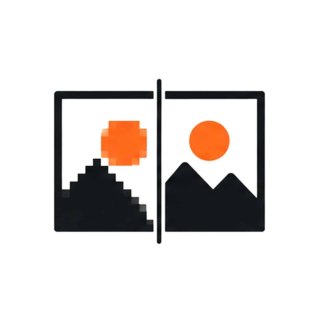
72 DPI vs. 300 DPI
Images created for websites are commonly much lower resolution than images prepared for print.
A small 72 DPI image may look perfectly fine on a screen. Print it at a larger size, though, and you may start seeing softness, jagged edges, or visible pixels. A 300 DPI image gives the printer far more detail to work with.
Pay Attention to the Final Size
A photo does not stay at the same effective resolution if you keep enlarging it.
For example, an image may be 300 DPI when placed at 4″ wide. Stretch the same image to 12″ wide and its effective resolution drops. Check the resolution at the size the image appears in your design.
Can You Fix a Low-Resolution Image?
Changing a number from 72 DPI to 300 DPI does not magically add detail. Software can add pixels, but it cannot fully recreate information missing from the original image.
If an image is too small, the best option is usually to find a larger, higher-quality version.
For logos, icons, and simple graphics, vector artwork is usually best because it can be resized without becoming pixelated.
Common Image Resolution Problems
Keep an eye out for:
- Images copied from websites
- Small photos enlarged too far
- Screenshots used as logos
- Files with a high DPI number but very small actual dimensions
- Images resized without checking effective resolution
Always review images at the size they will appear in print.
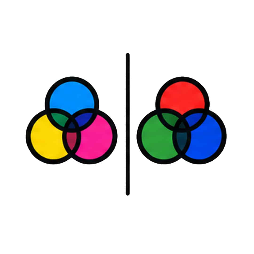
CMYK vs. RGB Color Mode
Screens and printing presses create color in different ways. Your computer, phone, and television generally display color using RGB. Commercial printing typically works with CMYK.
What Is RGB?
RGB stands for Red, Green, and Blue. Screens combine these colors using light. Because light can create very bright and saturated shades, RGB color may look especially vivid on a monitor.
What Is CMYK?
CMYK stands for Cyan, Magenta, Yellow, and Black. These inks are combined during printing to create the colors in your design. For standard commercial printing, CMYK color usually gives you a better idea of how the finished piece may look.
Why Can Colors Look Different in Print?
Some bright RGB shades do not have an exact CMYK equivalent. Highly saturated blues, greens, reds, and neon-style colors may look different after conversion.
If the design stays in RGB until the very end, those changes can be a surprise. Working in CMYK earlier gives you more time to review how the colors translate.
What About Spot Colors?
Some jobs use spot colors, such as Pantone colors. These are handled differently from standard CMYK printing and may be used when a project needs a specific branded color or special ink.
If your project uses a spot color, keep the correct swatch information in the artwork unless our team gives you different instructions.
Common Color Problems
Watch for:
- RGB artwork submitted for CMYK printing
- Extremely bright colors shifting after conversion
- Spot colors accidentally converted to CMYK
- Several versions of the same spot color in one file
- Expecting printed colors to look exactly like a bright computer screen
Our team can help you understand realistic color expectations before your project goes to press.
Fonts & Typography
Fonts can cause unexpected problems when a file moves from one computer to another. Missing fonts may be substituted automatically, changing line breaks, spacing, sizing, and sometimes the entire appearance of the layout.
Outlining Fonts
Converting text to outlines turns each letter into a vector shape. Once outlined, the file no longer depends on the original font being installed.
Outlining can work well for:
- Logos
- Headlines
- Short pieces of text
- Finished designs that will not need more editing
Keep an editable version of your original file before outlining anything. Once text becomes shapes, changing the wording is much harder.
Embedding Fonts in a PDF
When you export your PDF, use settings that embed fonts whenever possible. Then open the PDF and check:
- Headlines
- Body text
- Bold and italic styles
- Numbers
- Symbols
- Special characters
- Decorative fonts
Look for anything that appears different from the original file.
How Small Is Too Small?
There is no single font size that works for every project.
A lightweight typeface may become difficult to read at a size where a heavier font still looks clear. Paper, ink coverage, background color, and viewing distance can also make a difference.
Very thin type and tiny white text on dark backgrounds can be especially difficult to reproduce cleanly.
Simple Typography Tips
- Keep important text inside the safe area.
- Avoid very thin fonts at small sizes.
- Check text after outlining fonts.
- Review small reversed-out text carefully.
- Keep body copy comfortable to read.
- Double-check names, prices, phone numbers, dates, and URLs.

Crop Marks
Crop marks are small lines placed outside the artwork to show where the finished piece should be cut. You may need them for some jobs, but not all.
Common Crop Mark Problems
Avoid:
- Putting crop marks inside the finished page
- Letting marks overlap the artwork
- Drawing crop marks by hand
- Adding marks when they were not requested
- Confusing crop marks with the trim line
When in doubt, check the project specifications first.
Common File Formats for Printing
A print-ready PDF is usually the easiest format for finished artwork because it keeps the page size, graphics, fonts, images, and layout together.
Print-Ready PDF
PDF is widely used for commercial printing because it can preserve:
- Page dimensions
- Fonts
- Image placement
- Vector graphics
- Colors
- Bleed information
Even with a print-ready PDF, always open the finished file before sending it.
Editable Design Files
Sometimes, our design team may need the original design files. If you are sending files from programs such as Adobe InDesign, Illustrator, or Photoshop, include all supporting assets.
These may include:
- Linked images
- Fonts
- Graphics
- Other files used in the layout
A design document does not always contain every image inside the file itself.
Raster Image Files
High-resolution TIFF and JPEG files may work for some simple, single-page jobs.
PNG files are more commonly used for screens and websites. Pay close attention to resolution and color mode if one is used for print.
Microsoft Office Files
Files created in Word or PowerPoint can change when opened on a different computer, especially if fonts or page settings are different.
If you create artwork in one of these programs, export it as a PDF and check the PDF carefully. Contact us if you are unsure whether an Office file can be used for your particular project.
What If You Have Another File Type?
There are plenty of file formats for printing, and not every project starts in the same software.
If your artwork uses a less common format, contact DigiPrint before uploading it. In many cases, exporting a properly prepared PDF is the easiest way to keep the design intact.
Exporting Print Ready PDFs
Exporting the PDF is one of the last steps, but it can introduce new problems if the settings are wrong. Do not assume the exported PDF looks exactly like the source document. Open it and check.
Recommended PDF Settings
For commercial printing, use a high-quality or press-quality PDF preset when appropriate.
Your export should preserve:
- Correct page dimensions
- Bleed
- High-resolution images
- Embedded fonts
- Vector graphics
- CMYK or specified color information
Avoid aggressive image compression.
PDF/X Standards
Some print workflows use PDF/X standards such as PDF/X-1a or PDF/X-4.
The correct choice depends on the production workflow and the artwork itself. If our team provides a specific PDF standard for your project, use the requested setting. Otherwise, a properly prepared high-quality print PDF may be sufficient.
Single Pages vs. Spreads
For booklets and multi-page documents, export pages as individual pages rather than printer spreads unless your project instructions specifically request spreads.
The production team will usually manage page imposition during printing.
Compression
Heavy image compression can lower print quality.
Use export settings that keep images at an appropriate resolution for the final printed size. Avoid settings intended primarily for email, web viewing, or very small file sizes.
Final PDF Export Checklist
After exporting, confirm:
- The PDF opens without errors.
- Page dimensions are correct.
- Bleed appears where required.
- Images look sharp.
- Fonts display correctly.
- Colors appear as expected.
- No guides or template instructions are visible.
- Page count and order are correct.
- Crop marks appear only if requested.
- Nothing key has moved or disappeared.

Proofing Your Artwork
Proofing is your opportunity to review the job before the final production run. Treat the proof as a final check rather than a quick glance.
What to Review
Look closely at:
- Spelling
- Names
- Phone numbers
- Email addresses
- Website URLs
- Dates
- Prices
- Image placement
- Image quality
- Page order
- Trim position
- Folds
- Bleed
- Logos
- Special characters
Read the copy as well. Once you have looked at the same design several times, your eyes can start skipping over familiar text.
Common Artwork Mistakes
Most artwork problems come from a small group of recurring setup errors.
Low-Resolution Images
A small image may look fine on screen but become blurry after printing. Use 300 DPI images at their final printed size whenever possible.
Missing Bleed
If artwork reaches the finished edge but stops at the trim line, cutting variation may reveal white paper. Extend edge-to-edge artwork through the bleed.
RGB Artwork
Bright RGB colors can change during CMYK conversion. Prepare print artwork in the requested color mode and review converted colors before submission.
Missing Fonts
A missing font can change the appearance of your layout. Embed fonts in the PDF, outline type where appropriate, or package fonts when source files are requested.
Incorrect Page Size
The artwork should match the final trim dimensions. Do not use an oversized page simply to create extra space around the design.
Missing Linked Images
InDesign, Illustrator, and other design programs may reference external images rather than storing everything directly inside the document. Package those linked assets when supplying editable artwork.
Thin Borders Near the Trim
Even small cutting variations become easy to see when a narrow border sits close to the finished edge. Move the border farther inward, make it intentionally wider, or consider an edge-to-edge design instead.
Incorrect PDF Export Settings
Web-quality PDFs may compress images heavily, remove bleed, or change color settings. Use a print-quality export and review the finished PDF before uploading.
PDF/X Standards
Some print workflows use PDF/X standards such as PDF/X-1a or PDF/X-4.
The correct choice depends on the production workflow and the artwork itself. If our team provides a specific PDF standard for your project, use the requested setting. Otherwise, a properly prepared high-quality print PDF may be sufficient.
Single Pages vs. Spreads
For booklets and multi-page documents, export pages as individual pages rather than printer spreads unless your project instructions specifically request spreads.
The production team will usually manage page imposition during printing.
Compression
Heavy image compression can lower print quality.
Use export settings that keep images at an appropriate resolution for the final printed size. Avoid settings intended primarily for email, web viewing, or very small file sizes.
Final PDF Export Checklist
After exporting, confirm:
- The PDF opens without errors.
- Page dimensions are correct.
- Bleed appears where required.
- Images look sharp.
- Fonts display correctly.
- Colors appear as expected.
- No guides or template instructions are visible.
- Page count and order are correct.
- Crop marks appear only if requested.
- Nothing key has moved or disappeared.
Artwork Submission Tips
Once your print ready artwork is finished, keep the handoff simple. Clear file names and organized folders make it much easier to tell which version should be used.
Use Clear File Names
Name files in a way that identifies the project and version. For example:
company-brochure-final.pdf
is much clearer than:
final-new-3-revised2.pdf
If you submit another revision later, use a clear version number or date.
Package Editable Artwork
Collect the document, fonts, and linked graphics into one project folder. Adobe InDesign and other design programs include packaging tools that can help gather the required assets.
Check Linked Images
Before packaging the project, confirm that every linked image:
- Is available
- Uses the correct version
- Has enough resolution
- Has not been modified without updating the link
Submitting Multiple Files
In case your project contains several separate PDFs or pieces, label them clearly. Examples might include:
- front.pdf
- back.pdf
- insert.pdf
For multi-page documents, a single correctly ordered PDF is usually easier to review than a collection of separate page files.
Before You Upload
One final check can save a lot of back-and-forth. Open the exact file you plan to send and ask:
If this file printed exactly as I see it now, would everything be correct?
If the answer is yes, you are ready to submit.