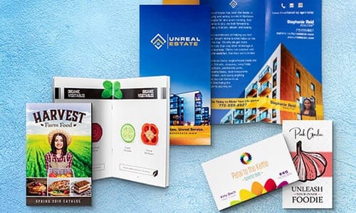
Think direct mail is outdated? A thoughtfully designed brochure works as your silent sales representative, telling your company’s story and building trust with potential customers. In fact, Forbes admits that brochures are essential for conveying specific details about a product – 49% of marketers use them in their marketing strategies.
Creative brochure ideas grab people’s attention and encourage them to take action. Poor design choices can quickly send your brochure to the recycling bin, while strong design helps turn interested prospects into actual customers.
In this blog post, our print shop in Reno discusses the most effective brochure design tips and how they can help you connect with your target audience.

Table of Content
Why an Effective Business Brochure Design Matters
Essential Brochure Design Tips for Success
Creative Brochure Ideas for Business Growth
How to Design an Effective Brochure That Converts
Best Business Brochure Design Tips & Practices for 2025
Why an Effective Business Brochure Design Matters
Research indicates that 60% of visitors use brochures to plan visits to attractions or businesses, and 62% become informed about an attraction or service as a result of reading a brochure. When done right, a brochure can:
- Make your brand more recognizable with a consistent look and feel.
- Catch people’s interest by focusing on what matters most—your products or services.
- Encourage action with a clear next step, whether that’s making a purchase, booking a consultation, or learning more.
Not all brochure marketing materials should look the same. Here are a few custom brochure design tips depending on your industry and audience:
- Retail & E-commerce: Bright images, clear pricing, and special offers can make a big impact.
- Real Estate: High-quality photos, detailed specs, and easy-to-find contact info help buyers make decisions.
- Healthcare: A simple, clean layout with professional fonts and patient-friendly language builds trust.
- Technology: Infographics and minimalist designs make complex ideas easier to understand.
Brochure printing should feel like a natural extension of your brand identity, and its design should make an instant connection with the reader.
Essential Brochure Design Tips for Success
Here are essential design tips to ensure your brochure stands out and gets results:
Know What You Want Your Brochure to Do
Before you begin custom printing for brochures, take a step back and think about what you want your brochure to accomplish. Ask yourself:
- Is this about getting your brand out there, or do you want it to drive sales?
- Are you introducing something new—a product, a service, or an event?
- Will this be more of an educational piece, something that informs rather than sells?
Once you have the characteristics of a brochure in place, shaping the content gets easier. A brochure meant to sell should grab attention with bold headlines and clear calls to action.
If you’re looking to inform, structure the layout so that details are easy to follow. Keep it focused and useful – that’s what makes a brochure worth reading.
Choose the Right Brochure Layout
The brochure layout you choose influences how people interact with it. Here are a few common styles and when they work best:
- Bi-fold Brochure – Simple and professional. Great for company profiles, reports, or portfolios where a clean layout matters.
- Tri-fold Brochure – The classic brochure fold choice. It breaks information into sections, making it easy to follow.
- Gate-fold Brochure – Opens like a reveal, making it ideal for premium products or special offers.
- Z-fold Brochure – Works well when you need to guide the reader through a process, like a step-by-step guide or a brand story.
- Die-cut & Custom Shaped Brochure – A unique shape or interactive fold can make your brochure more memorable.
Keep the design clear, legible, and with your audience in mind. Choosing the right brochure design for your business will ensure your message comes across the way you intend.
Make Your Design Easy to Read and Navigate
What to add to a brochure? An effective design should guide the reader’s eyes without them even thinking about it. Here’s how to make that happen:
- Font Choices: Typography affects how easy it is to read printed text. Serif fonts like Times New Roman help guide the eyes, making long passages easier to follow.
- Color Choices: Stick with colors that match your brand. The wrong color can send the wrong message.
- Spacing Matters: Don’t cram everything together—give text and images room to breathe.
- Headlines That Work: Bold, clear headings help people skim and find what matters. No one wants to dig through a wall of text.
Keep it simple, clear, and easy on the eyes. If people enjoy reading, they’ll stick around.
Make Visuals Count
When custom printing a brochure, high-quality images and graphics must be printed on it. Here’s how to do it:
- Use high-quality images. Crisp, clear visuals keep things looking professional.
- Go for custom illustrations. Stock photos are fine, but original graphic elements add personality and character to your brand.
- Stick to your brand’s look. Keep your colors, logos, and icons consistent. It helps people recognize and remember you.
- Turn data into visuals. Infographics make complex information easy to digest—and way more interesting than a wall of text.
The key brochure design tip is that your marketing materials should make a strong, lasting impression on the reader.
Creative Brochure Ideas for Business Growth
A custom brochure attracts new customers and boosts business growth. Here are some creative elements you can use:
Interactive Brochures
Make a few digital interactive additions to your printed brochure, and it becomes a tool people use.
- QR codes: Let people scan straight to your website, portfolio, or booking page—no typing, no searching.
- Augmented reality (AR): Show, don’t just tell. A quick scan could bring up a 3D model, an interactive guide, or a virtual walkthrough.
- Scannable videos: A demo, a behind-the-scenes look, or a quick how-to—just one scan away.
Simple design elements like these make it easy for people to connect, explore, and take action.
Minimalist vs. Bold Designs
Some brands thrive on simplicity, while others make a statement with bold visuals. Which one suits you best?
- Minimalist: Think clean layouts, soft colors, and plenty of breathing room. This style keeps things sleek, uncluttered, and easy on the eyes—perfect for brands that value elegance and clarity.
- Bold: Bright colors, unexpected designs, and bold typography draw attention. This could be the right choice if your brand is all about energy, creativity, or making a good impression.
Choose a style that feels right for your brand and the people you want to connect with.
Sustainability & Eco-Friendly Brochures
More businesses are thinking about the way they print brochures. If you want a more sustainable printing option, here are a few ways to make a difference:
- Choose recycled paper or biodegradable materials—they work just as well and cut down on waste.
- Switch to soy-based inks. They’re easier on the environment than traditional petroleum-based inks.
Small changes like these add up, so why not make them kinder to the planet?
How to Design an Effective Brochure That Converts
Whether you’re promoting a service, a product, or an event, here’s how to create a brochure that gets results.
Keep the Copy Clear and Persuasive
People don’t read brochures like they read books; they skim through them. Instead of listing features, highlight how your product or service solves a problem.
Make Your Call to Action Obvious
What do you want people to do after reading your brochure? Visit your website? Book an appointment. Call you. Convert it clearly and make it easy to understand – big, bold text, a simple URL, or a scannable QR code can all help.
Put Offers Where People Can See Them
If you’re offering a discount or limited-time offer, don’t hide it in the fine print. State it in a conspicuous place: front and center, in bold type, or inside a well-placed box. Give people a reason to act now rather than putting the flyer aside for “later” (which rarely happens).
Avoid the Common Pitfalls
Even the best message can be ruined by poor design. Too much text? People tune out. Low-quality printing? It makes your business look unprofessional. Hard-to-read fonts? No one wants to struggle to get the information they need.
A brochure is your first impression. Ensure your design and content are visually appealing and engaging to your audience.
Best Business Brochure Design Tips & Practices for 2025
The best designs feel personal, interactive, and visually engaging. Here’s how to design effective brochures in 2025:
Make It Personal
With professional brochure printing services, businesses can tailor brochures to different audiences, whether by modifying the message, highlighting relevant products, or even changing images based on customer preferences.
Bring It to Life with AR
Static pages are fine, but adding augmented reality (AR) elements can turn a plain-looking brochure into an interactive experience. It’s a simple way to bridge the gap between print and digital without overwhelming readers.
Use AI as a Helping Hand
Businesses can use AI-powered design software to experiment with layouts, fonts, and color schemes. But the best brochures still have a human touch.
Keep your brochures relevant, make them easy to engage with, and always design with the reader in mind.
Final Thoughts
A thoughtfully designed brochure is an effective way to connect with customers. If it is informational, clear, and useful, it will not only be read, but it will also generate sales.
For quality brochure printing services, DigiPrint is the place you can count on. Our team of experienced professionals can guide you through the process and help you create a brochure that accurately reflects your brand and effectively communicates your message.
Contact us today!


